
Appearance
Form Task Templates
Form Task Templates are reusable form configurations for user tasks within workflow steps. Define a form once and use it across multiple workflow action flows, ensuring consistency and saving time.
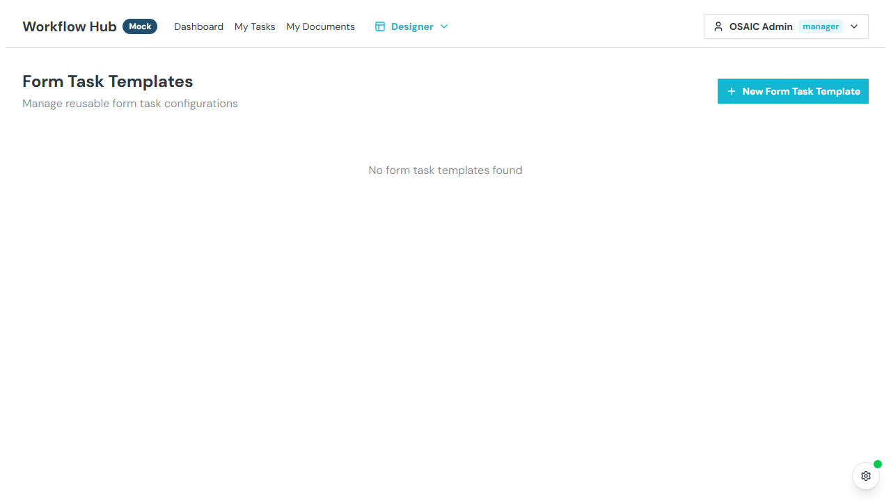
What You See
Form task templates are displayed as a grid of cards, each showing:
- Name — the template title
- Description — what the form collects
- Field count — number of form fields
- Usage count — how many flow actions reference this template
- Actions — an Edit button, plus duplicate and delete icon buttons
Creating a Form Task Template
Click New Form Task Template. The editor opens as a dialog.
Template Details
- Name — a descriptive name (required)
- Description — what this form collects
Default Assignee
Optionally select a default assignee — the user who will be assigned this task by default when the action runs. This can be overridden in the flow editor or at launch time.
Form Fields
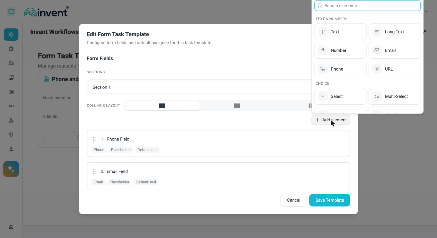
Click Add element to open the element picker. Elements are grouped by purpose, and the picker has a search box.
| Group | Elements |
|---|---|
| Text & numbers | Text, Long Text, Number, Email, Phone, URL |
| Choice | Select, Multi-Select, Checkbox, Checkbox Group |
| Date & time | Date, Time Slot |
| Layout & content | Markdown (Instruction), Repeating Group |
| Other | Documents, File Upload |
Click a field in the list to open its editor. The field dialog carries a Label, Help text ("Add guidance or hints shown beneath the label"), the type-specific options below, and a collapsible Conditional visibility section.
INFO
The field dialog states: "Changes apply immediately. Close the dialog when done." Your edits are held in the template editor as you go — they are written to the template when you click Save Template.
Choice Field Options
Select, Multi-Select and Checkbox Group fields draw their options from one of four tabs:
| Tab | What it does |
|---|---|
| Static | A hard-coded list you type in. Supports bulk entry as JSON. |
| Dynamic | Values come from a variable reference — see Options from a variable. |
| Standard list | A shared list from Standard Lists. |
| HTTP | Options fetched through an HTTP lookup preset. |
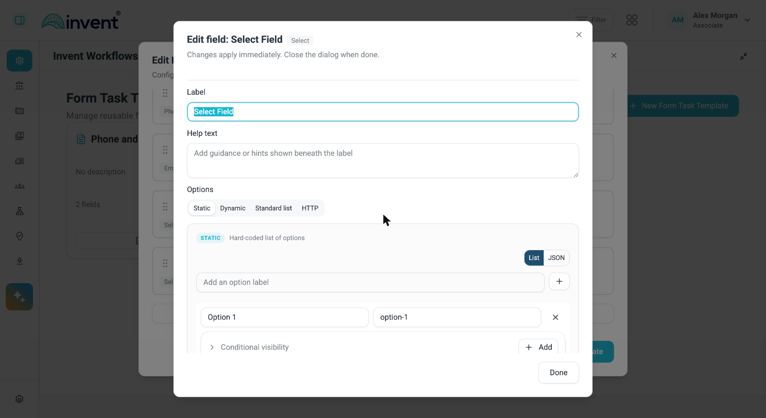
Every choice field also has a Default option control, which either picks one of the options directly or takes its value from a variable.
Options from a variable
The Dynamic tab builds the option list from a template expression evaluated when the form is shown, rather than from a list you maintain. Use it when the choices are produced earlier in the same workflow — most often by a JavaScript or HTTP action whose output you have already shaped.
Enter the expression in the field, for example:
{{ actions("JavaScript").output.result }}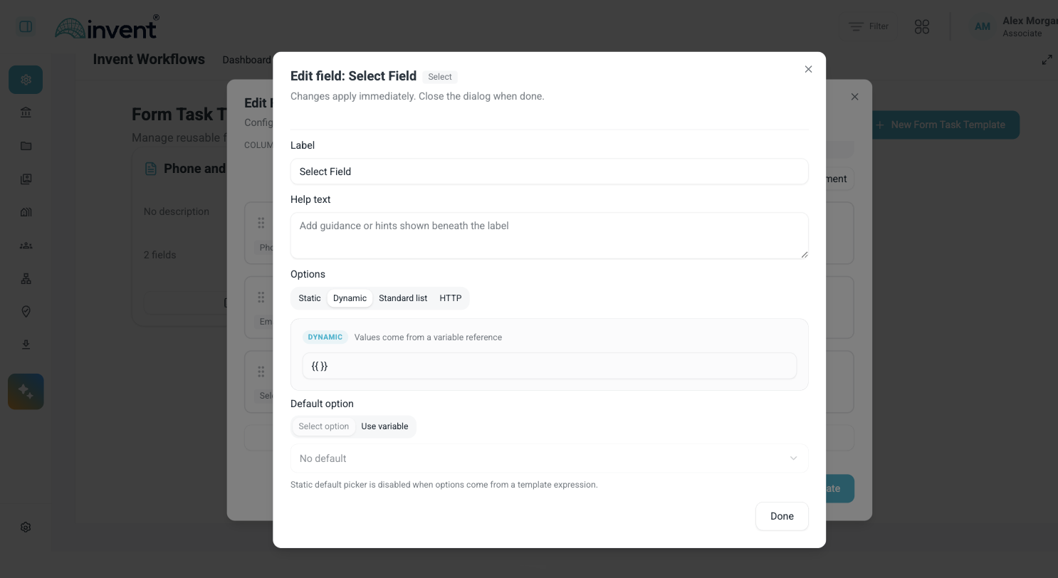
INFO
Choosing Dynamic changes how the default works. Default option switches to Use variable, and the fixed-choice picker is disabled — the interface explains why: "Static default picker is disabled when options come from a template expression." The options are not known until the form runs, so there is nothing to pick from at design time.
Multi-Page Sections
Forms can be divided into multiple pages (sections) for better organization of complex forms.
- Sections list — each section is a row showing its name and a field-count badge
- Add Section — click to create a new section
- Per-section columns — each section has its own Columns layout selector, set to one, two or three columns
- Section visibility — sections can be conditionally shown or hidden based on field values
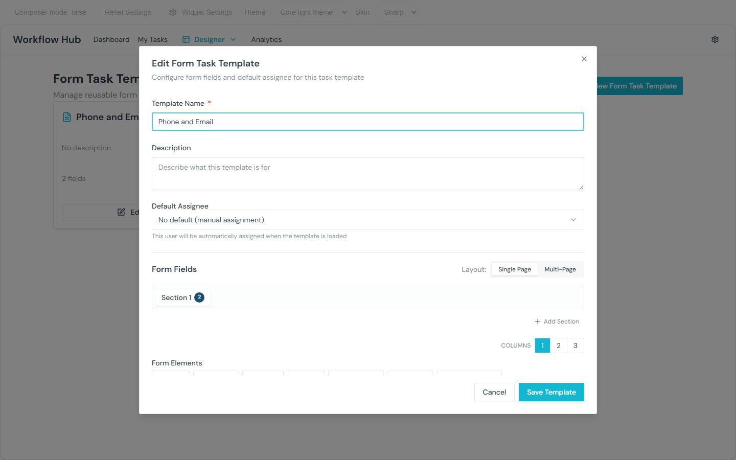
INFO
When a form has only one section, the section UI is hidden and the form behaves as a single page.
Multi-Column Layout
Each section is laid out in one, two or three columns, chosen with the Columns layout selector directly beneath the section — visible in the screenshot above.
A Preview Form button at the foot of the field list shows the form as the assignee will see it.
Repeating Groups
A Repeating Group element lets users add multiple sets of the same fields — for example, multiple beneficiaries, line items, or contact entries. The fields inside the group repeat as a block, and validation runs independently for each entry.
HTTP Lookup Presets
Select, Multi-Select and Checkbox Group fields can fetch their options from an external system.
The request itself is not configured on the field. It lives in a reusable HTTP lookup preset, and the field simply points at one:
- Open the field editor and choose the HTTP tab.
- Pick a preset from Select a preset.
- Optionally set a Default option, either a fixed choice or a variable.

Presets are managed centrally, so the endpoint, its credentials and its response mapping are defined once and reused across every template that needs them. The request is made by the backend — the upstream URL is never exposed to the browser.
WARNING
Presets are referenced by id. If a preset is retired, every field bound to it must be repointed at a replacement before its template will save.
Visibility Conditions
Form task template fields support visibility conditions with two scopes:
form.*— reference other fields in the same form (e.g., show "Details" ifform.needsDetailsis true)input.*— reference workflow launch input values (e.g., show "Account Number" only ifinput.accountTypeequals "Existing")
This allows forms to dynamically show or hide fields based on context.
Markdown (Instruction) elements also support visibility conditions and variable name references, enabling dynamic read-only content blocks within forms.
JSON Bulk Entry
The Static options tab has a List / JSON toggle. Switch to JSON to paste a whole option set at once instead of adding entries one by one — useful for large lists or options generated elsewhere.
Three shapes are accepted, as the editor itself states:
{ "Label": "value" }
[{ "label": "...", "value": "..." }]
["Label", ...]
Validation Rules
Number and date fields support cross-field validation:
- Greater than / Less than another field
- Equals / Not equals a value
- Range constraints
Using Form Task Templates
To use a form task template in a workflow:
- Open the Flow Editor for a step
- Add a User Form action
- In the action configuration, select the form task template
- The form fields are loaded from the template
You can also define form fields directly in the flow editor action without using a template.
Managing Templates
| Action | Description |
|---|---|
| Edit | Modify the template's fields and settings |
| Duplicate | Create a copy |
| Delete | Permanently remove |
Tips
- Use form task templates for forms that appear in multiple workflows (e.g., "Compliance Review", "Client Verification")
- The default assignee saves time when the same person typically handles a certain type of task
- Visibility conditions make forms adaptive — users only see the fields relevant to their situation